Playsimple Games:
PlaySimple Games, founded in 2014, is a leading mobile game developer known for popular word games like Word Jam and Word Trip. Based in Bangalore, they focus on creating engaging, free-to-play casual games with a global audience.
About the project
-
September 2019 - October 2019
-
WordJam & WordTrip
-
UX Director
UI Designer
Game Designer
Product Manager
-
User Research, Game Experience Design , Observational Research, Market Comparison, Heuristic Evaluation, Wireframing, Prototyping
Overview:
This project, completed for PlaySimple Games, aimed to optimize the in-game purchase experience for the games WordJam and WordTrip. Through the introduction of A/B testing and strategic UX modifications, the goal was to improve in-app purchases (IAP), user interaction, and ultimately conversion rates. The project focused on key areas such as navigation clarity, user flow improvements, and visual information presentation in the store.
Problem
The in-game store screens for WordJam and WordTrip were identified as underperforming in terms of user engagement and conversion rates. The team needed to optimize the store experience to increase key metrics, including:
First-time payer conversion
Retention (rolling retention)
Engagement with purchase opportunities
Revenue per daily active user (IAP/DAU)
Additionally, the player journey was analyzed, revealing issues with decision fatigue and unclear UI elements leading to player drop-offs during the purchase process.
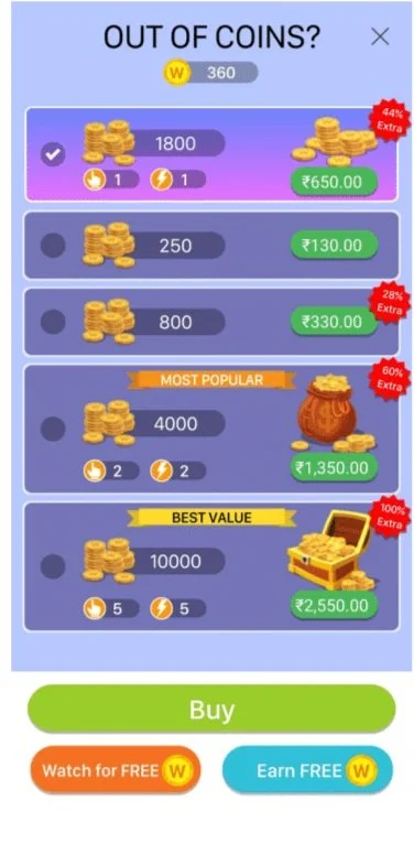
Previous designs
Objectives
Product Objective:
Increase in-store conversion rates through clearer, more intuitive navigation and presentation.
Enhance payer behavior, encouraging more users to make their first purchase.
Improve IAP/DAU by optimizing store screen layout and introducing better user interaction elements.
Design Objective:
Simplify the interface by making the navigation and purchasing decisions clearer and more user-friendly.
Improve store clarity through the presentation of information, especially around pricing, offers, and inventory.
Reduce drop-off during the purchase journey by streamlining the steps involved in making a purchase.
Research & Discovery
Key findings included:
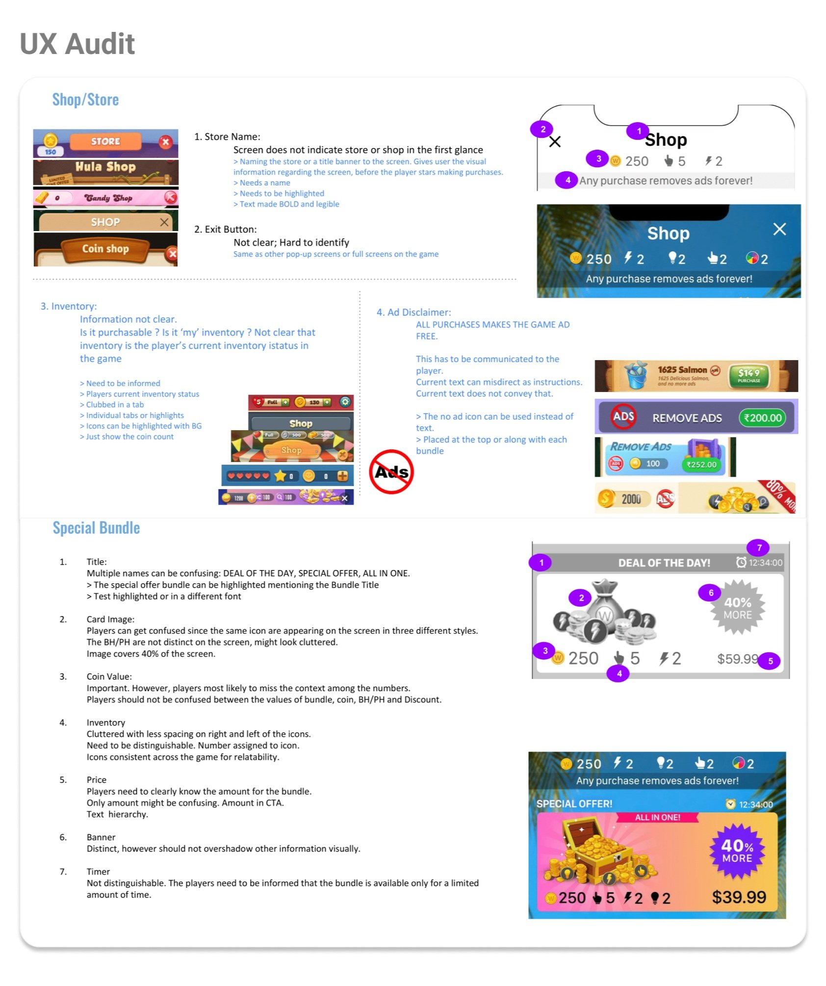
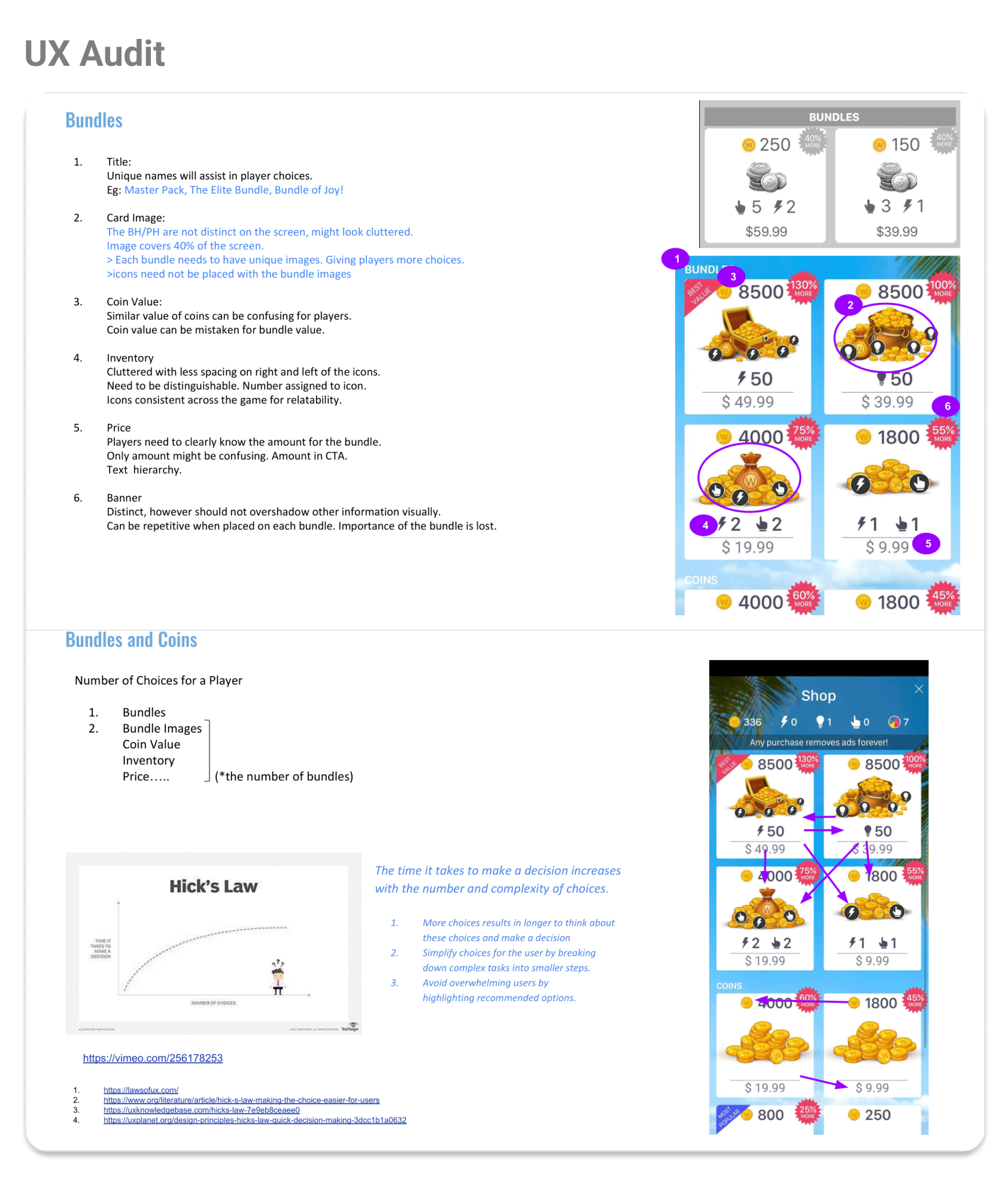
User Experience Audit:
The WordJam store had unclear navigation, insufficient spacing between elements, and visual clutter, making it hard for players to process information.
Users were confused by the layout, often unsure of what to purchase and the exact details of their inventory.
The lack of clear price indications and CTAs led to missed opportunities for conversion.
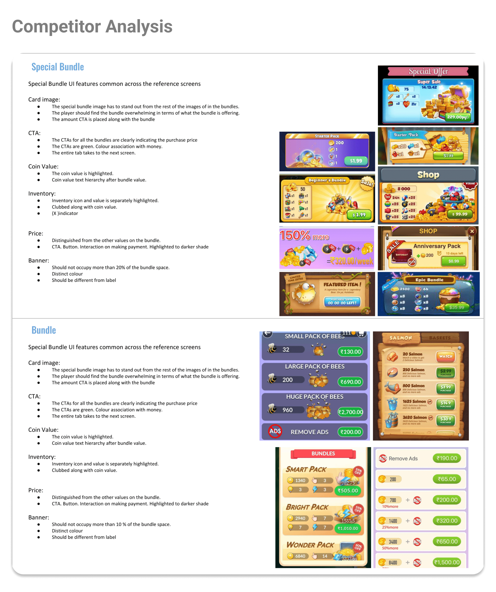
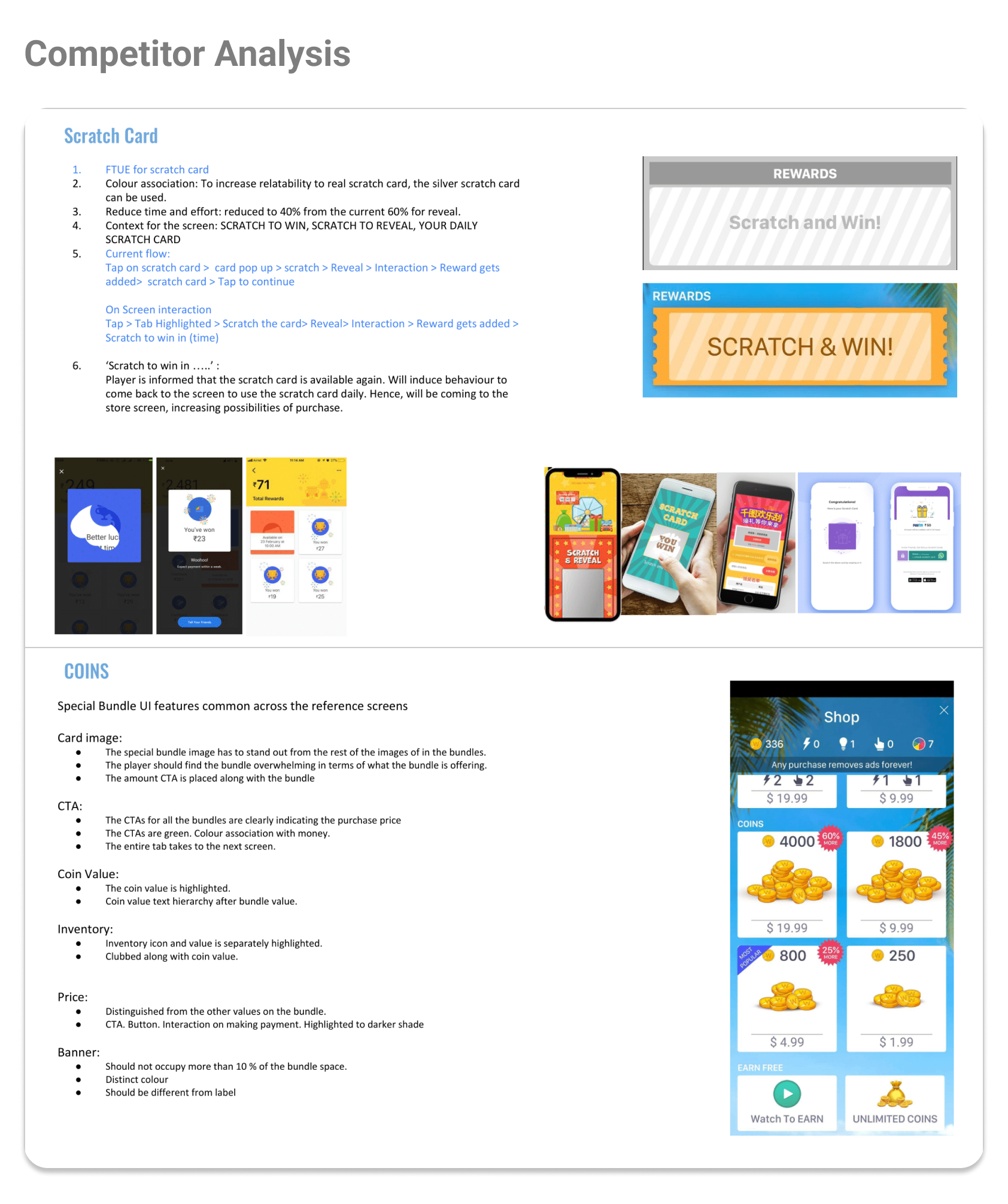
Competitor Analysis:
Analysis of games with strong IAP metrics highlighted the importance of clear bundling, easily identifiable offers, and streamlined user flows.
Competitors emphasized minimalistic design, color coding for CTAs (e.g., green buttons for money), and simple layouts that reduced cognitive load.
Key Design Hypothesis
Based on the research, the team formulated key hypotheses for the revamp:
Hypothesis 1: Improving the clarity of bundle offers will increase the purchase rate.
Hypothesis 2: Simplifying the layout and reducing decision fatigue will improve the player journey, leading to higher conversions.
Hypothesis 3: A streamlined, more intuitive flow in the purchase process will reduce drop-off rates.
These hypotheses laid the foundation for ideating possible solutions to the in-game purchase experience. To kickstart the creative process, I invited the team to Crazy 8 brainstorming workshop, where quick sketches were done using pen and paper.
This exercise helped generate diverse design ideas in a short time, allowing the team to visualize potential layouts and features that aligned with the design goals.
Post the workshop, I refined the sketches for the screens.
Design & Iteration Process
Wireframes & Prototyping:
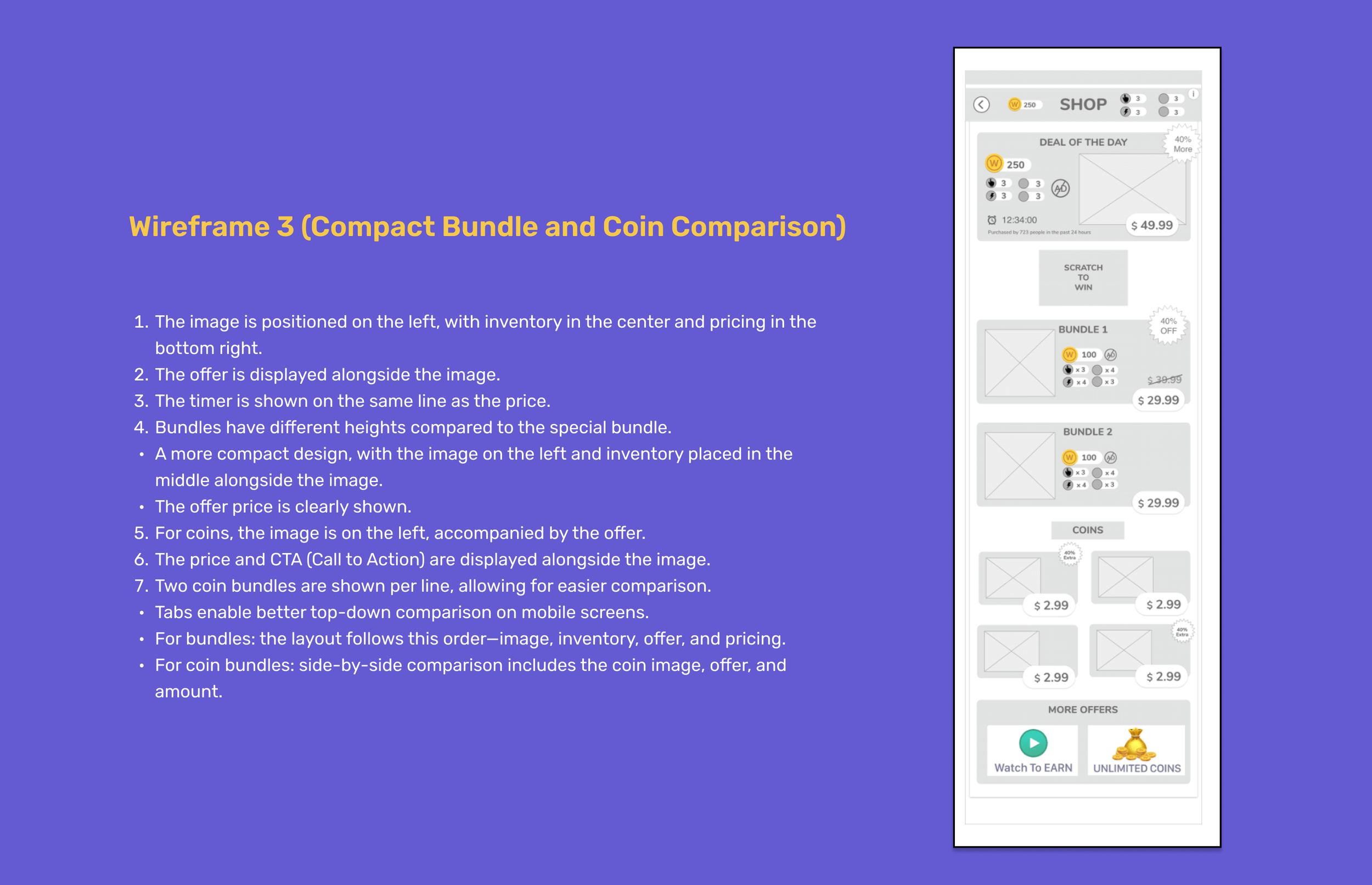
The team developed low-fidelity and high-fidelity wireframes with the following changes:
Store Layout Overhaul:
Bundles and items were given clearer labels (e.g., “Master Pack,” “Elite Bundle”) to assist players in making informed decisions.
The layout was decluttered, with distinct spacing for each element to aid visual processing and reduce confusion.
Improved CTAs:
The CTAs were redesigned to stand out, using color associations (e.g., green for money) and clearly showing the bundle prices alongside the coin values.
Psychology of Purchase Behavior:
Addressing motivations like exclusivity, social influence, and the emotional reward of purchases were factored into design decisions.
Introduced visual rewards and prompts (e.g., “Scratch to Win” with time-limited rewards) to induce repeat engagement and conversions
Usability Testing & Feedback:
Several rounds of usability testing were conducted to validate the assumptions:
Players preferred a simplified layout where the visual elements were well spaced and easy to navigate.
The reduction of steps in the purchase flow led to smoother interactions and faster decision-making.
The introduction of social proof, such as showing how many users had purchased a bundle, was well-received and led to increased engagement with premium bundles.
Handover
After completing the pen and paper sketches, I translated them into medium-fidelity mockups using Adobe XD.
Following refinement, I collaborated closely with the UI designer and game animation artist to enhance the visual aspects of the design.
I also worked alongside a dedicated developer who implemented the design in Unity.
Assets were handed over via Zeplin to ensure smooth integration.
Throughout the process, I collaborated with the game designer to document the UX workflow and shared key design decisions with internal stakeholders.
Final In-App Purchase Screen
FTUE Screens
A/B Testing & Results
The revamped design was tested through A/B testing across multiple variants.
Variant 1: Traditional vertical layout with minor adjustments.
Variant 2: Horizontal layout with additional scratch card mechanics and layout fixes.
Variant 3: Matrix card layout incorporating horizontal flow and scratch card FTUE.
Key Metrics:
Rolling Retention: The retention rate saw significant improvement with Variant 2, achieving up to 23.64% improvement in D3 retention compared to the control.
IAP/DAU: Variant 2 showed a 17.06% increase in gross IAP/DAU, a clear indicator that the layout changes positively impacted the purchase behavior.
New Payer Conversion: Variant 3 showed a 7% expected upside in IAP/DAU, with first-time payer conversion seeing a projected increase of 2 basis points.
Outcome:
The In-App store screen was applied to both Word Trip and Word Jam, and similar implementation was implemented in later games. As of 2024, the design is still on the game app. :)
Product Team Data
Challenges and Learning
As the first hire for the UX Team, my primary goal was to showcase the UX methodologies and improvement through data post-revamp.
The revamp process faced challenges around balancing the amount of information on the screen without overwhelming the player. Initial designs included too much information, which negatively impacted conversion rates. By breaking down complex tasks into smaller steps and introducing a visual hierarchy, the team was able to create a more focused user journey.
Key Learnings:
Simplification leads to clarity: Players responded better to clearer, less cluttered layouts, which helped improve their decision-making process.
Rewarding engagement: The integration of psychological reward mechanisms, such as the scratch card, played a significant role in increasing repeat visits to the store.
Importance of A/B Testing: Testing multiple layout variants allowed the team to zero in on what worked best for conversion without sacrificing user experience.
Through this project, I enhanced my self-learning skills by adapting to new tools, refining UX methodologies, and continuously seeking ways to improve user experience through data-driven insights


